28.06.2025: Dampf ablassen mit dem eigenen Comic, ein Workshop im Gustav-Lübcke-Museum, Hamm.
21.06.2025: Workshop „Entwirf Deinen eigenen Superhelden“ auf der Illu25.
16.01.2025: „Das Grundgesetz der Tiere“ ist für den Grimme-Preis nominiert.
02.10.2021, 19 Uhr: Signierstunde auf der Vernissage von “unveröffentlicht“, in der Ludwiggalerie, Oberhausen.
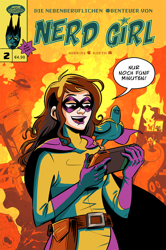
08.08.2020: Der aktuelle Sammelband “Das Leben ist kein Ponyhof – Das Internet schlägt zurück!” ist ab jetzt bei Kwimbi vorbestellbar.
15.07.2020: Neue “Nerd Girl”-Folge: Auflösung.
Comic-Archiv: Die Kapitel
RSS-Feed